- Location: Koramangla, India
- Architects: FADD Studio
- Year: 2015
- Area: 5000 ft²
Context
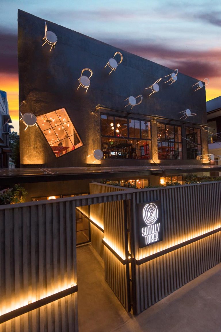
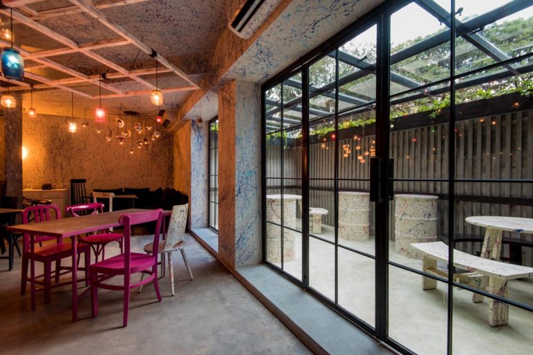
This bar/restaurant is located on a main road with several high street brads and restaurants on either side and opposite it. It was an old house that was used as a commercial space. The two levels had several columns and odd angles in the ceiling.
Brief
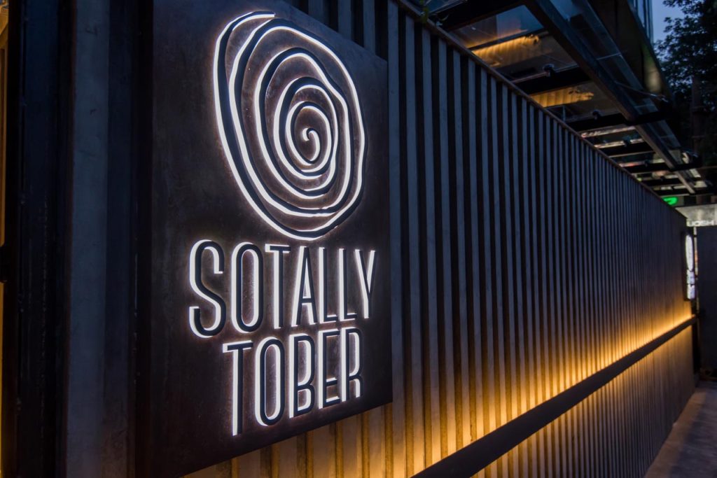
The clients came to us with two things. First, a name that was a reversed version of two words, ‘totally’ and ‘sober’ – something that sounded as if the name itself was intoxicated – and second, a very open mind. They wanted something that was different than what was being done in Bangalore which was mainly earthy and industrial. They wanted something novel and unique.
Response
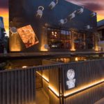
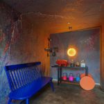
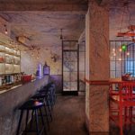
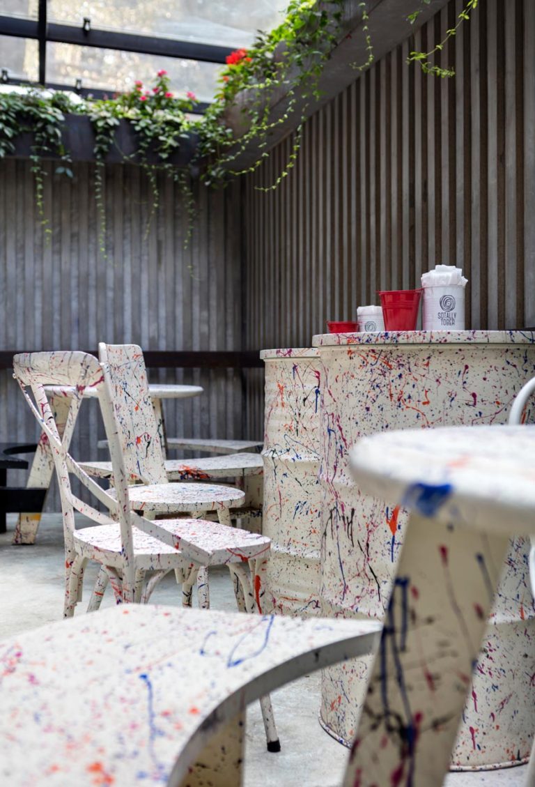
If our studio were to be inspired by a name which played with the words “totally” and “sober”, then this project would have had to be the first! While we were most definitely sober while conceptualizing the space, the concept itself was on a total high! Because it was on a main road, we knew the façade had to be eye-catching. So we attached metal chairs at a 90 degree angle from the wall to appear to be gravity defying chairs successfully making anyone, inebriated or not, stop in their tracks. The feeling of surprise is only elevated after entering the space, which is completely covered in Jackson Pollok style drips, sprays and splashes. The reason to do this was the following rationale. First we realized that the one thing that people do not treat like one unit is the walls. Sure there are wallpapered and painted walls, and feature walls to highlight a space; but to treat all walls and ceiling as one (other than white) as if cut from a monolith is something we never see. The thought of treating the wall with a bold and eclectic concept intrigued us. Of course painting the wall with one color would be too boring; a wallpaper too repetitive; we needed movement and expression; we needed something that looked different each time we saw it and we needed it to be done in a way that also elicited excitement and curiosity!
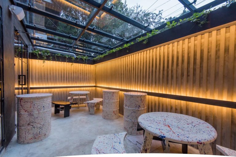
So we looked at artists and found inspiration in Jackson Pollack the, abstract expressionist painter who is known for his drip paintings. So we decided to paint the walls in his style and thus achieved the movement and rhythm we were looking for. It was whimsical yet sophisticated; it was audaciously delicate; it was just the thing we needed to set the mood for the space.
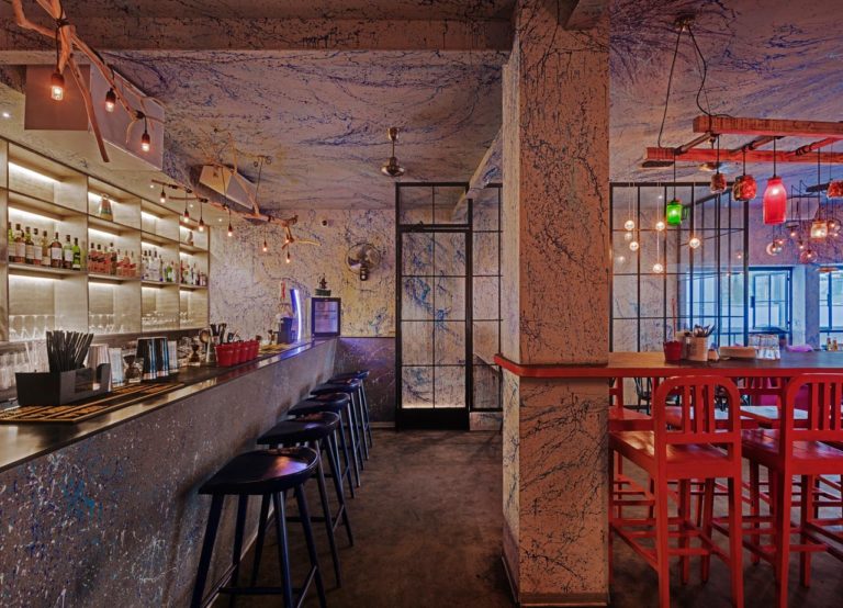
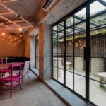
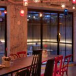
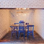
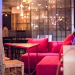
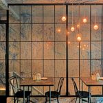
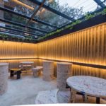
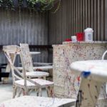
Within this shell we, we added simple chair and table clusters in colors chosen to enhance the blues of the walls. Black, vermillion and raspberry and blue were the dining color blocks. We finished the space with custom made lights, which were mostly elements from the kitchen – whisks, ramekins, baking trays, mason jars, bottles, and even teapots – and these added the eclectic-ness to the space. This concept continues outside with the painted furniture against a ribbed cement wall. This quirky, bold and all-encompassing concept of soft splashes and sprays of blues and grays lends a vibe of energy, rhythm and drama.
