- Location: Bangalore, INDIA
- Architects: FADD Studio
- Area: 145 m²
- Year: 2018
- Photographs: Gokul Rao Kadam
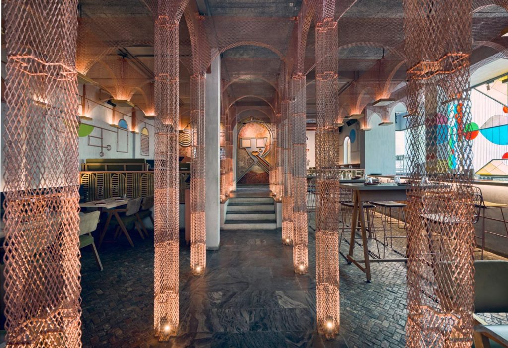
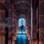
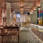
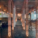
Imagine an Asian restaurant inside a construction site at any chapel. Imagine walking down the central isle looking at an alter in the making as you appreciate the support of the metal columns and arches alongside and above you. Imagine the stain glass on the sides streaming in the sunlight and imagine hand-painted murals on walls.
Walk into Misu. Stop imagining.
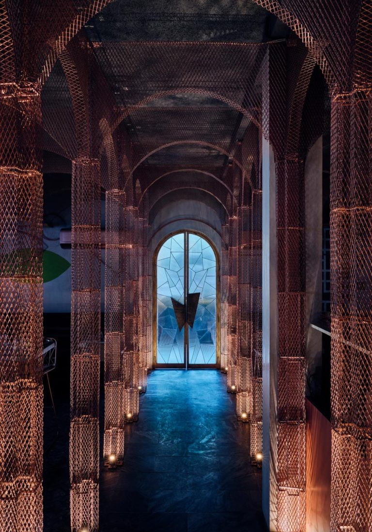
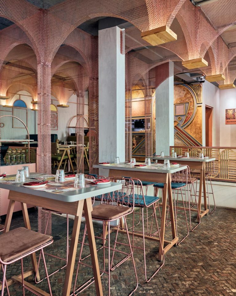
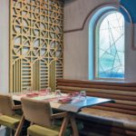
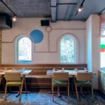
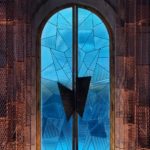
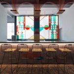
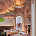
And see the contemporary and edgy interpretation of a restaurant inside a church with classical and colonial western elements meeting fine and minimal Japanese shapes in a beautiful and mesmerizing confluence of glamour and grunge. Indirect lighting softly illuminates the mesh arches and hand painted walls to create an intimate atmosphere at night. The deconstructed, almost cubist portrait of a girls face acts as the central point which the arches lead up to. During the day the abstract stain glass at the back of the bar overpowers the area becoming the focal point for a fresh and hip ambiance.
Because of its intentional unfinished and work-in-progress sensibility, patrons feel the need to come back to see the progress. Misu 2.0 is a fusion of concept and materials, a wonderful evolution from its predecessor.
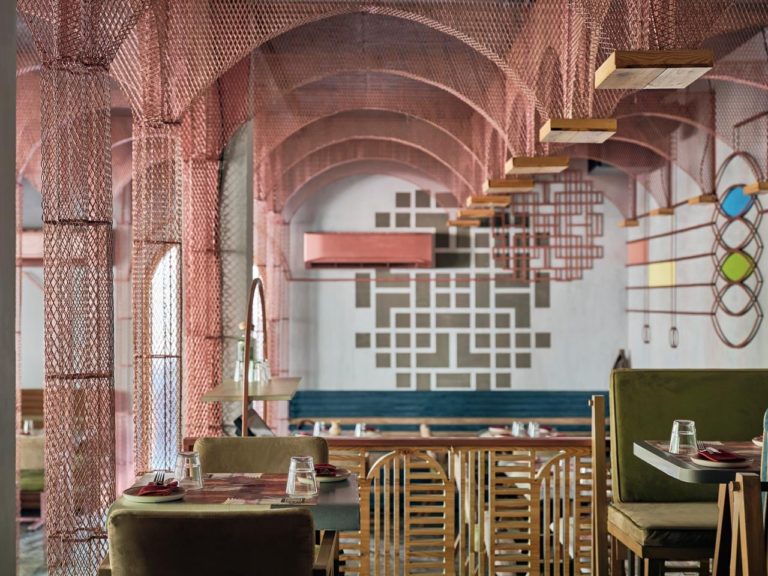
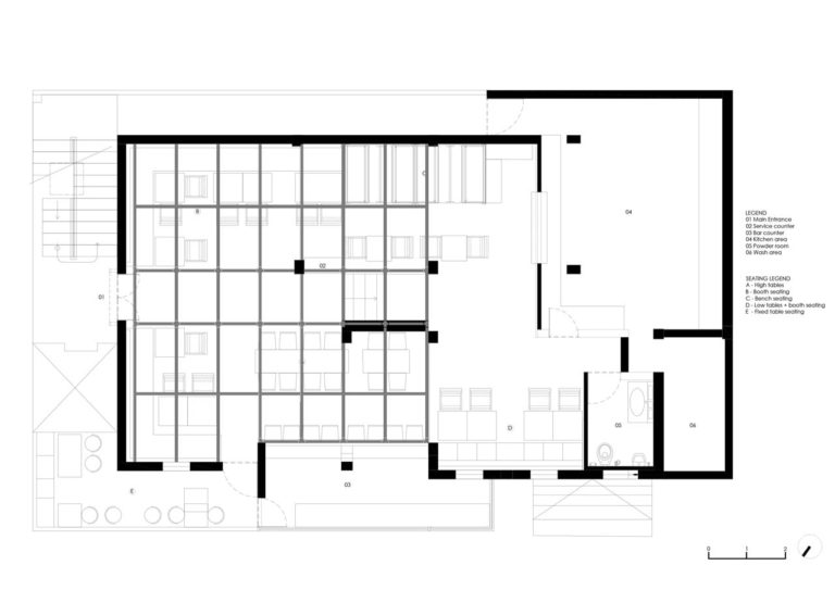
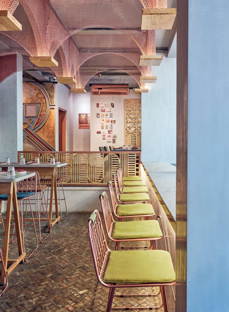
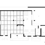
When we saw the site, an old building with arches, we knew at once we wanted to take some of the structural remnants inside as well. Since this was the second Misu we were designing, we also wanted it to have a bit of familiarity from the first one for brand recall. So we laid out some ground rules – we would bring back all our deep colours of blue, green and mustard and crimson, and use copper in some way as the first Misu too had in in abundance. And of course, the client maintained that he would like a face of sorts to be present as that worked in the first restaurant. The rest of it was as blank as a canvas could be. The space planning helped in realizing that this space, like the first would be divided by a central passage. There would be a fairly large step up and this area would have a lower ceiling.
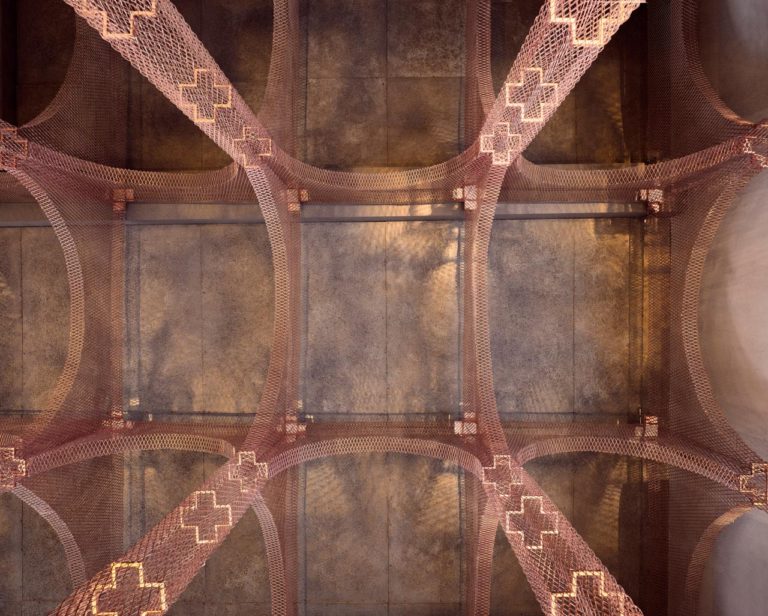
It stays to a trend that Asian restaurant often have an Asian face that is larger than life. But also it breaks away by the way the face is done. It is abstract using lines and shapes. The setting itself breaks away from the trend that Asian restaurant have to look typically “Asian” with elements like bamboo, greenery, cane, and natural materials, Asian symbolism and typography. When you see an Asian restaurant, usually you can spot it from a mile away. With this, we used Roman church elements like stain glass, wall painting and a central isle to create a counter-intuitive feel for an Asian restaurant.







Comments are closed.